What does best practice brand communication look like in the technology sector?
In a post at the start of 2022 – What are the top marketing challenges facing technology businesses and how to fix them? – we outlined five key challenges we see technology companies confronting when it comes to their brand and their marketing.
These five areas remain relevant to the technology sector, where competition is fierce and customer experience has to deliver. Making small improvements in these areas can have a significant impact.
As a recap, the areas we identified were:
- Learning how to service the market, not just marketing the service
- Assuming customers know what they want
- Improving communication and support
- Helping prospects find value in your product
- Moving prospects from trial to sale.
To support that post, we wanted to provide tangible examples of technology brands that we felt embody some of these areas in their marketing and show what we feel “good” looks like. Below are brands that we feel are clear on who they serve, the problems they target and how they specifically solve them.
redcentric
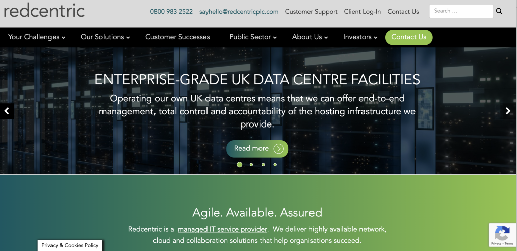
The first thing that hit us when we arrived on the redcentric website is “Your Challenges” in the far left of the navigation bar. As we mostly read left to right, that is arguably the first thing visitors will see, and it immediately invites visitors to click and see if RedCentric can help with the challenges they have.
The tone of voice and style maximises the second-person use of “you” and “your”, which is a powerful way of positioning the company as being genuinely customer-centric.
The use of the home page carousel effectively conveys the key messages that the company wants to land, and quickly. At the time of writing, redcentric is focusing on its relationship with Amazon Web Services, securing an NHS contract, operating UK data centres and preparing for the ISDN/PSTN switch-off.
Their content demonstrates they are well-trusted and work right at the cutting edge of IT management.
There are numerous ways to get in touch, including Live Chat on the site.
To stand out even more, we’d recommend making more of video and audio content. Doing this would propel their social media channels, as well as introduce more of the brand’s personality. The positioning and content are of high quality, but to appear more approachable, the company could highlight its people and residual expertise more. This would mark redcentric out in a fairly marketing-conservative sector.
abas
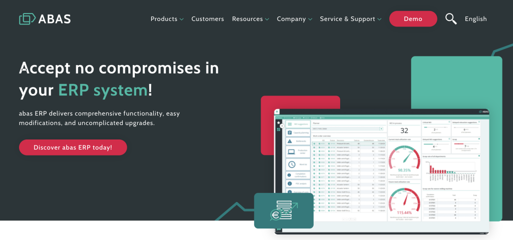
abas ERP places the prospect at the centre of its online experience. As with redcentric, the positioning uses the words “you” and “your” rather than “our”, ‘we’ and “us’, which sets a customer-centric tone.
There are two very prominent and differentiated calls to action: the red “Demo” and “Discover abas ERP today” buttons, giving the user different options for how to engage.
What struck us about the abas Demo is that it isn’t gated. Without entering an email address or telephone number, a visitor can access a variety of short videos that cover everything from basic introductions to the software, more detailed videos discussing each key feature and a range of customer success stories.
Offering ungated content is becoming increasingly important as more buyers (not just in technology) conduct the majority of their search before even making contact; making content freely available in this way can result in potential customers being more engaged and purposeful when they do make contact. Providing in-depth and useful information for free teases out more interested potential customers and ensures resources are targeted only at the most interested customers rather than dealing with “all the leads created” by insisting on contact details first.
abas also encourage visitors to select content in formats that they prefer, which accounts for different people wanting information in different ways.
Combined with the introduction of people in the hero shots, abas goes a long way to present a customer-focused brand that is seeking to serve.
To go even further, we’d recommend making more of the video element to make their good case studies even more compelling. This content could then be used right across their digital marketing mix. Also, a filter on the blog content would enable visitors to self-service themselves as much as possible, putting them more in control of the information they digest.
Lightspeed Systems
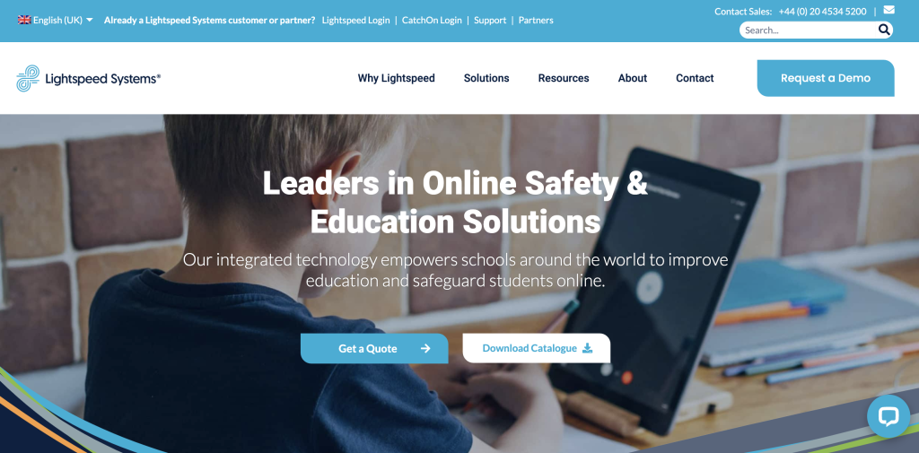
Education technology and student safety company Lightspeed Systems provides products and services to keep systems and students online.
What made Lightspeed stand out:
- An immediate option for customers to log straight in.
- The “Why Lightspeed” option in the navigation – again the first area most visitors will settle on.
- The clear triple whammy of call to actions – “Request a Demo” in the top navigation and “Quote” and “Catalogue” options in the hero graphic.
- Positioning a child in the main page graphic in a safe and secure way.
As you move through the site it’s apparent that brand strategy has been very carefully considered. There is a clear brand hierarchy and naming structure. which means that all products are prefixed; for example, Lightspeed Filter, Lightspeed Alert, Lightspeed Classroom Management and Lightspeed Analytics.
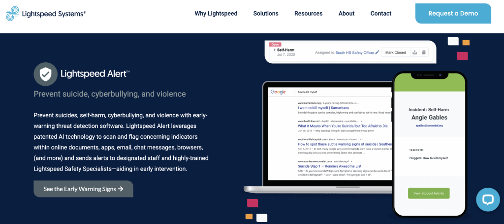
In each product profile spot, such as the emotive Lightspeed Alert below which identifies concerning search requests, there is a very clear positioning statement written to stimulate action, high-impact graphics and action-oriented buttons that, when clicked, deliver the visitor to a specific landing page with a short video and options to request information and demo.
Throughout its communications, Lightspeed Systems demonstrate a clear understanding of its market and its users and position this in a helpful, non-invasive way.
As with other brands highlighted in this post, being able to illustrate the transformation you provide through your storytelling and bringing it to life via customer images and video testimonials are powerful ways to present the benefits of your technology. This, partnered perhaps with a Customer Intranet/Academy, could help Lightspeed elevate its communications and proposition.
Aula Education
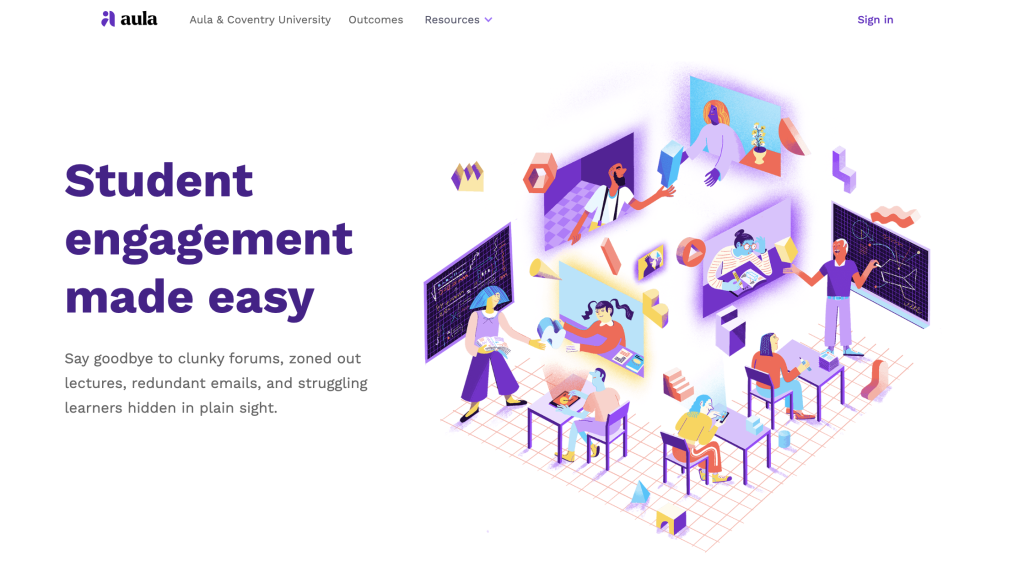
There are a number of up-and-coming solutions companies in the elearning space. One of these companies, Aura Education, has already been acquired in its first two years.
The Velo team selected Aura Education because of its light and spacious look and feel alongside its deceptively simple but incredibly effective positioning. It screams problem diagnosis.
Targeting LMS providers, the navigation is about as simple as it gets. There are user case studies, testimonials and stories housed in “Outcomes”, while “Resources” houses blog posts, the help centre and support requests.
While it is very well positioned with some great content, we found it wasn’t easy to check out the actual software. There are no clear links to make requests, fill in forms or get in touch. The software is accessible, it seems, only as an iOs download. We feel there is work to do to make the product, which looks great, more commercially available.
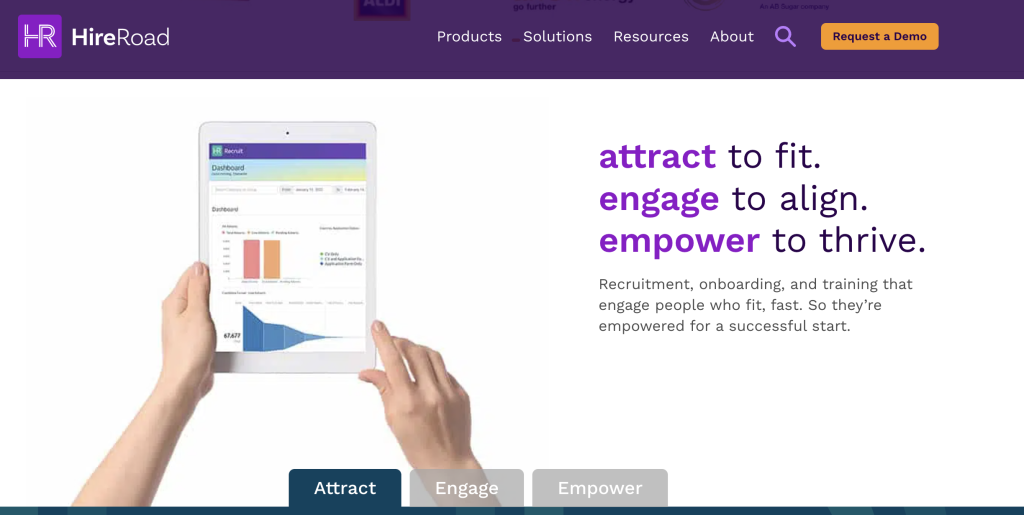
HireRoad
Recruitment has truly embraced advances in technology.
International recruitment SaaS company HireRoad helps organisations attract, recruit and onboard new employees using technology to ensure there is harmony right through the process.
In a similar way to other companies in this post, HireRoad has carefully segmented the process and created service offers within the brand structure, such as HR Recruit, HR Onboard, HR Learn and the wraparound HR Analytics to report on all of it, which help organisations significantly improve their HR processes.
The site experience, as with others, benefits from a deceptively simple navigation, so visitors aren’t overwhelmed by choice. Doing this helps traffic people to the content they want most.
There is a “Demo” call to action. However, it is a “fill in a form and wait to be contacted” demo, which in our view, is not really in keeping with the concept of a customer-centric brand.
We’d recommend reviewing the navigation and organisation of content to improve the customer experience. The objective of a website is to give people information to help them take action. Being able to easily find content that turns a window shopper into an interested enquirer is crucial if conversion is to be improved. In addition, visitors cannot easily find content that helps them self-serve. Case studies, for example, are tucked away in the “Resources” section. It took a few clicks to find and download this highly impressive Aldi case study.
Are you a technology brand looking to improve how you attract your ideal customer?
Our experience with brands such as Sage, Cisco and Anaplan could be what you need to make a positive change. Start the conversation here.
Recommended reading
What are the top marketing challenges facing technology businesses and how to fix them?