Essential considerations when designing an effective B2B marketing exhibition stand and experience
Two powerful psychological forces mean that the trade exhibition sector will inevitably come back strong. Firstly, human beings need to connect. And secondly, we seek experiences.
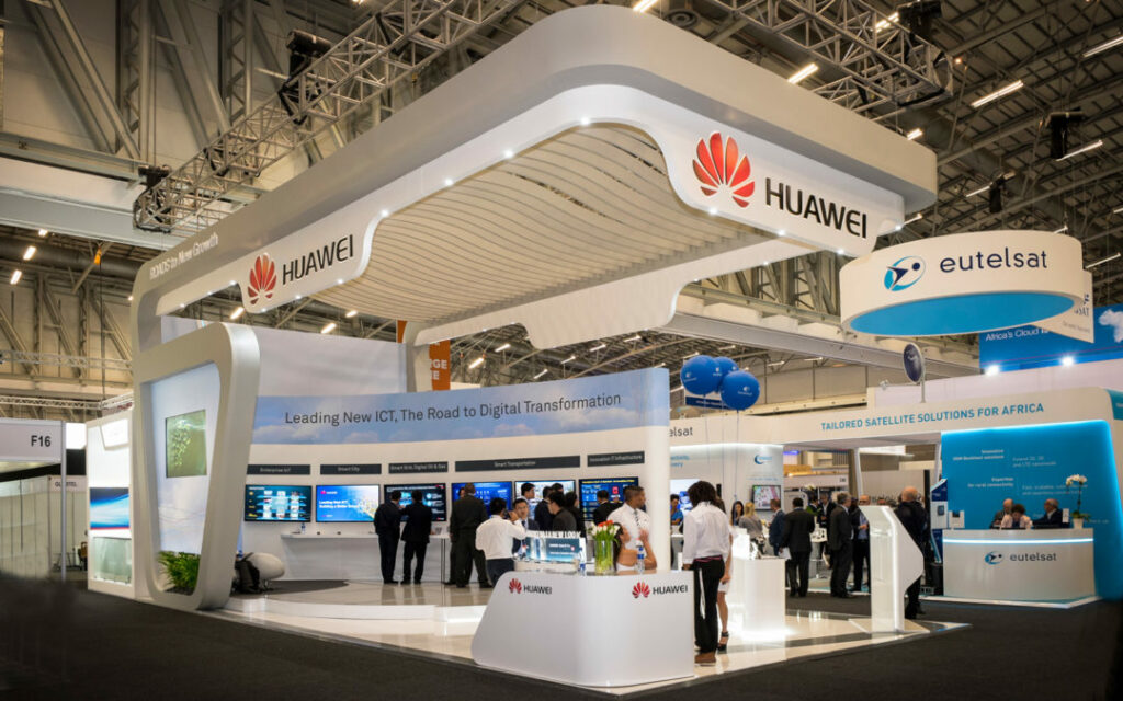
From an exhibitor’s perspective, it is natural to want to create the most eye-catching exhibition stand designs to help maximise attraction and return on investment at a trade show.
There are only a few precious seconds to convey the right message to attendees about how we can help them with the challenges they face.
Why stands need to stand out!
You’ve decided to invest in attending an exhibition. Which means you’re essentially entering a market place where many competing organisations will be in the same place, at the same time. And most of them will look and feel the same.
Before you even think about designing your space, decide on your attendance objectives.
Why? Because launching a product, announcing yourself to a new market, looking to build brand or generate interest all require a nuanced approach in terms of messaging and design.
Launches, for example, need to plan for expert Q&A and presentation, trial and demonstration and lots of hands on interactivity. Brand building may involve an altogether different approach in offering some simple value through benchmarking assessments via on stand touchscreens.
In this article, we cover seven of the primary ways you can bring together a creative and stand-out exhibition experience.
-
Getting your messaging right
Above all, your messaging should be simple – assuming someone is walking past in 3-4 seconds.
Simple messaging is one core proposition. A logo is another. Think advertising when it comes to exhibition stand messaging and focus on customer transformation rather than features. Positioning yourself to help address or even eliminate known customer problems is far more likely to encourage people to stop and take a closer look.
Often, B2B exhibitions stands are over loaded with multiple messages that just make for a complicated and confusing first impression – and an organisation that is perhaps trying too hard be too many things to too many people.

-
Your messaging needs to be visible
You’ll want to explore how you maximise the visibility of your core message. This means making sure it is visible as widely as possible. Obviously, the main back wall of the stand needs to feature your messaging prominently, at a height that can be easily read from distance.
But, depending on the type of stand and positioning, you should also consider the back of the stand (if onto an aisle or an island stand) and the sides too (both inside and out).
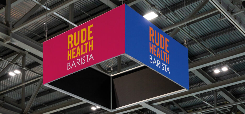
Also consider working to maximum height. Push the show boundaries on getting your logo or key message as high as possible. Some shows allow this, others charge extra.
And similarly, consider the floor. Sponsors usually get additional privileges like floor-based directional signage. Sponsors of wifi areas or cafe and networking areas can also use this agreement to achieve additional promotion to the stand.
You have a finite time to get as many “interested” people to your stand as possible.

-
Create an inviting and open space
The same rule applies for shell scheme spaces as it does for huge booths. Putting any kind of gate at the entrance to the stand in the form of a welcome desk or product display can sometimes be the biggest barrier to attracting people into a conversation.
With a strong single message enticing people in, the last thing you want is to place a barrier in front of them.
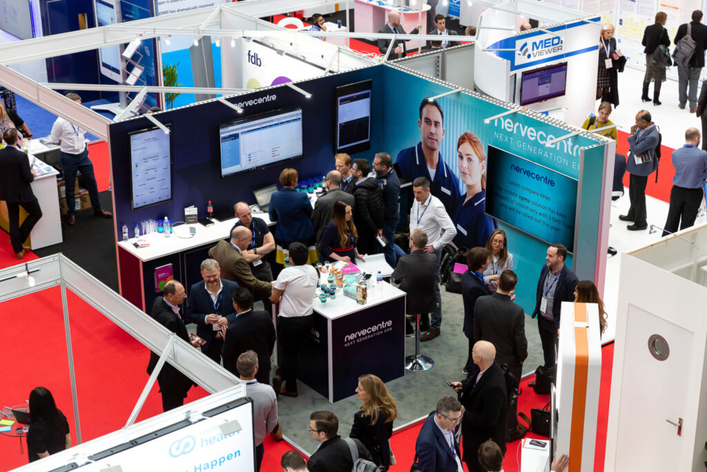
Set welcome desks and product displays as far back as you can and use the front of the stand as a funnel. Think of what you’re doing as running a retail shop. How frustrating is it when you walk into a shop for a browse to be met with a store operative within seconds of entering?
Aim to add value to the experience and lead on information and interactive assets that don’t necessarily require immediate interaction with stand staff.
And plan a creative space that is both inviting and on-brand by using aligned carpets and colour schemes.

-
Focus on the experience: Interaction is key
In most B2B sectors, the gestation period for product and service switchover is months, if not years. So, view your activity at the show as a “conversation starter” and nothing more. Accept that you are unlikely to make direct sales during the show and that the real work begins in the days, weeks, and months after. (This should be set in your show objectives).
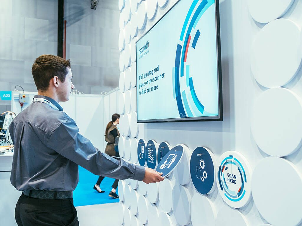
Focus on the experience and offer something you know your competitors probably aren’t. It doesn’t mean you need to be dramatically cutting edge using augmented or virtual reality (but if you can, you should!), but you should be thinking of a value-adding on-stand hook and a takeaway to keep the conversation going.
The best way to do this might be a screen-based survey where visitors can benchmark where they are in their profession or service provision. They get an immediate snapshot of feedback but get a full report and recommendations after the event.
If you want something a little more fun, consider games on interactive screens, floor-based games, and fairground games – offer a prize and run the contest throughout the show. Create milestones on your stand by announcing winners each day.
Make sure any games link to your messaging; whether it’s about precision, economy, strength, performance, some will fit messaging more than others – but there is always a way to get creative and tie it in!
Interactivity of any kind is going to be the best way to capture data in a non-invasive way, especially if you are following up with something they are both expecting and valuing.

-
Design soft contact areas into your space
If space allows, consider having areas where people can just hang around. Exhibition delegates are always grateful for a bit of wifi, a coffee, or an ice cream in the summer months.
Remember, you have them in your space, slowly being exposed to your core messages and they may end up being enticed in to taking up one of your offers to interact. So, use every little trick in the book to tease people in.
-
Don’t forget functional aspects that add value
Demonstration areas, scheduled Q&A and presentation sessions, and small seated spaces create mini events around your stand when you can prepare for a higher level of traffic.
It is important, again if space allows, to create “events” on-stand. As most exhibition delegates are probably on a learning mission, they’ll be grateful for free expert sessions.
If you are giving seminars as part of the exhibition, make sure you direct people back to the stand in any presentations – maybe with free vouchers or exclusive offers they can redeem on the stand.
Meeting rooms also demonstrate you are at the show to do business, so if you include this in your design, be sure to utilise it in your pre-show marketing to make some bookings. If stand visitors see your meeting room being used throughout the show, it may tease a few into deeper conversations. Staging is everything.
-
Have a stand manning plan
You’ve made all the effort to create an inviting and impressive stand experience. And now your people are going to blow it.
Whilst it isn’t a specific design element, there is nothing worse than seeing stands that have way more sales people than they need, often talking to each other, on their phones, or even eating and drinking.
So an active stand manning plan – with clear guidance on what to do when the stand is quiet or busy – is imperative.
As a rule, stand staff that aren’t occupied with a visitor, running stand activities, or manning the welcome desk, should move off the stand and let the space breathe. Leave it open for people to investigate. It could be a good opportunity to check out the competition.
And when you’ve got all that in place…
Don’t forget to promote your presence at the exhibition before, during, and after the event through a dedicated comms campaign which will help you maximise your return on investment.
Are you looking to make the most of events this year? Do you want to talk about how you make events a big part of your customer experience again? Drop us a line here.
Further reading:
Why an experiential event should be part of your thinking as a B2B marketer


